


The logos and hats from minor league baseball are amazingly creative and most teams take some random local thing and turn it into an amazing brand. The Hillsboro Hops are a relatively new team, having transferred from Yakima, Washington in 2013. The former Yakima Bears (with its boring name and logo) used the move to make a brand that is unique (no other team has ever been named the Hops), has multiple meanings (regional beer history and baseball lexicon of bad hop, short hop, etc), and has the potential for such cool logos as you see above. It is really unfortunate that the Hops are associated with the Diamondbacks and I must hate them.
This past baseball offseason, there was a flurry of activity as minor league affiliation contracts were expiring and teams were searching for improvements to their minor league setups. As a masochist and Rockies fan (which might be the same thing), I try to keep up with the teams affiliated with the Rockies. The Rockies happened to be one of the teams that made some changes to their minor league system.
This past baseball offseason, there was a flurry of activity as minor league affiliation contracts were expiring and teams were searching for improvements to their minor league setups. As a masochist and Rockies fan (which might be the same thing), I try to keep up with the teams affiliated with the Rockies. The Rockies happened to be one of the teams that made some changes to their minor league system.
| Colorado Rockies Minor League Team Changes: |
AA: Tulsa Drillers (2014) to New Britain Rock Cats (2015) to Hartford Yard Goats (2016)
High A: Modesto Nuts (No change)
A: Asheville Tourists (No change)
Short Season A: Tri-City Dust Devils (2014) to Boise Hawks (2015)
Rookie: Grand Junction Rockies (No change)
With the new teams came new logos and hats, which clearly need to be ranked. Here is my descending list of Rockies affiliates based on their branding.
#6: Grand Junction Rockies
The Grand Junction Rockies used to be the Casper Ghosts. Yes, the Casper Ghosts. In one quick move from Wyoming to the Western Slope in 2012, the team went from one of the best names in the organization to the worst. Boring. Boring. Boring. The logo is the Colorado Rockies logo with a mesa on it instead of a mountain. I understand the desire to associate your gateway team to your major league team as it provides those newly drafted players their first taste of professional baseball. However, they did not need to make a carbon copy of the Rockies look.
The Grand Junction Rockies used to be the Casper Ghosts. Yes, the Casper Ghosts. In one quick move from Wyoming to the Western Slope in 2012, the team went from one of the best names in the organization to the worst. Boring. Boring. Boring. The logo is the Colorado Rockies logo with a mesa on it instead of a mountain. I understand the desire to associate your gateway team to your major league team as it provides those newly drafted players their first taste of professional baseball. However, they did not need to make a carbon copy of the Rockies look.


Even their inaugural season special logo is bland. This logo has nothing to it. Ugh.

To compare, this is what the Casper Ghosts brought to the table. Neon colors and a seamed ghoul? Different and way better.


#5 Boise Hawks
The main logo of the Boise Hawks is not terribly exciting. Orange bird holding a bat with red accents and some nice script. Nothing great, but nothing terrible either. That being said. . .


. . . the Hawks excel with their alternate lids. Talons ripping through the face of the crown? Talons ensnaring a hardball? Those are pretty cool. It is too bad all of their brand isn't this clean.


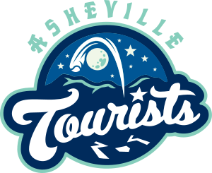
#4 Asheville Tourists
Asheville used to have an amazing logo of a traveling bear in a Hawaiian shirt. My best friend's dad wore his Tourists hat all the time and it was awesome. In 2010, they remade their brand and incorporated the moon into their design. The moon theme was a throwback to the original baseball team in Asheville - the Moonshiners. While this logo probably is better than its fourth place finish, my judgement is jaded by the absence of that sweet traveling Ted E. Bear.


Look at how touristy that bear looks.


#3 Albuquerque Isotopes
I love the Isotopes' logo. The A made to look like an atom with a baseball electron stands out. While the script "Isotopes" beneath the logo could have dropped their ranking a bit lower (no way it was dropping below GJR), the cap is slick. The hat alone produced a podium finish for Homer Simpson's team.


#2 Hartford Yard Goats
The newest addition to the Rockies baseball family, the Yard Goats combined their local sports history, their long-standing area railroad traditions, and a fun social media presence to build a fantastic brand in only a few months. The name comes from a rich railroad history in the Hartford area. Yard goats are locomotives that are used to move cars around a rail yard. The colors (and hype song) for the logo came directly from the last professional team to reside in Connecticut's capital, the Hartford Whalers (who had their own top-notch logo). The goat logo is cool enough by itself, then you throw in the horned H and YG text logos. All in all, this is a brand I can get behind. I already have convinced the wife that a Yard Goats hat is coming my way come birthday time.


#1 Modesto Nuts
After much hand-wringing and internal arguments, the Yard Goats ultimately fell to the Modesto Nuts. The walnut road alternate hat was my first minor league cap purchase. If you see me wearing a hat, there is a high probability that Wally the Walnut is perched on my giant dome. I like the black/red/brown combo and the use of the dual mascots. This brand's simplicity and overall quality make it the top brand in the Rockies minor league system.


Do you disagree?
UPDATE:
I was questioned by a coworker on my lack of attendance at minor league baseball games, having lived in Denver while the Zephyrs played here. While I was quite young, I do remember going to at least one or two games of theirs at Mile High Stadium back in the day. I'm sorry that I lied to you. :-)
No comments:
Post a Comment